Sunday, October 24, 2010

A little mo' content

Sorry for the long absense. On one hand I haven't been very busy, but on the other hand that means I didn't have anything to show you anyway. I didn't land the past two gigs in getting published class. Gladly the Colonel Windpipe character tided me over. Our class was recently approached by Colors magazine to create a few "portraits" of international heroes for their upcoming issue. It's an interesting concept, as the content for this issue is all user input on their website: http://lab.colorsmagazine.com/superheroes

We were to choose 2 heroes, and illustrate two literal or metaphorical portraits. I chose Evans Wadongo and Carlos Celdran. Evans is a young man from Kenya who has created a charity producing solar powered lanterns for impoverished villages, where their only light source at night is dangerous and costly kerosene lanterns. In a video interview, he admits to cutting one or two meals of his own per day to fund the project. This is what I illustrated:


It's not necessarily a portrait of Evans. I'd prefer it to just be seen as a Kenyan child, in the context of the article. The portrait is of his efforts to light up the night for those in need. Interestigly I sort of unknowingly poached a lot of this imagery from both my own previous work and the work of my friend Dan Woodling.

Mine (colors n' everything):

and Dan's wonderful concept piece for his senior animated film:
http://1.bp.blogspot.com/_cC6cTVc5alQ/TI79b72tBgI/AAAAAAAAAHA/b1-G01-gbaA/s1600/glowlybear.jpg

I'll take the easy way out and just call it inspiration. It must be, if I didn't notice until after I was finished, right?

Carlos Celdran is a lively tour guide in Manila, who was recently arrested for his protest display at a catholic service. A bill is currently in the works to increase the awareness of contraceptives throughout the country, which is struggling with population control. The church threatens excommunication for those responsible, as their stance on contraceptives is very, albeit irrational, clear and concise. Look it up, it's preatty interesting. This is what I illustrated:


It's a little bit like a political cartoon, as it's a little cutesied up and lighthearted, but I'm happy with it.

That's all for now. These will be submitted to Colors mag and we'll see if they get accepted. The magazine is known for its photos, and it's usually pretty serious business. I'm not very sure my playful stuff with be their cup of tea. Here's to hoping, though!

Tuesday, October 12, 2010

Some more stuff!

I'm churning out so much work lately. Oddly, I don't feel overworked of exhausted. If I can keep this sort of stamina for the rest of my working career, that'd be great!

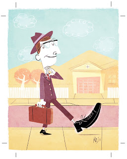
The SIC (Scad illustration club) is having a gallery show later this month. The theme is Urban Legends, a spooky subject matter probably due to the closeness of Halloween. I decided to buck the tend and just do something plain stupid. A pun of sorts...or just a literal translation. So here's Bigfoot:


Anyway, strangely, this should be my first gallery exposure since coming to SCAD. I suppose that's my fault. I just haven't had the drive until now.

Later.

Sunday, October 10, 2010

Submission for Colonel Windpipe's flickr set

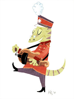
This here folks is "Hurdy Gurdy" Gus the Gecko. He heads up the obscure intrument section of the Colonel's band. Err....he will soon. I haven't joined or submitted him yet. It's our next project, due thursday, but I've gotten it out of the way early. It was too much fun to sit on for too long. Once again, I utilized the same technique as the cowboy and zookeeper. I'm loving it. And it's so quick! Anywho, enjoy!

Tuesday, October 5, 2010

New sketch

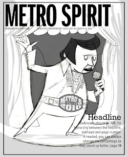
So the Metro Spirit folks ended up not liking anybody's sketch enough and came back requesting Elvis imagery and the possible inclusion of their logo for the main feature of the issue. Ok here you go:


Quite simple, but then maybe my first was too complex? I'm not sure. If I won't 'win' this assignment, it might be a good thing. I'm swamped in other work as it is...

Later!

Sunday, October 3, 2010

Retro Crunch! And other things.

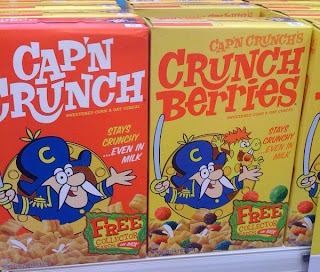
So there we were. Caitlin and I, walking down the isles on our routine Friday afternoon grocery run to Kroger. We usually point at the terrible package design and characters (especially Kroger's branding...eesh). But we were both elated to see these boxes of Cap'n Crunch:


(photo from retroist.com. Caitlin got a few shots on her phone, but I don't have 'em.)

I suppose I'm a little late to the party, as people have talking about this since August. Oh well. At least I got to stumble on them in the wild. It baffles me that design (the lettering! love it.) was ever this good, AND that it ever went away. Everything seems so uninspired these days. Perhaps the true creatives are too proud to turn their talents toward a marketing obsessed industry. Either way, I've never wanted to buy a box of sugary-nothing cereal more than after seeing this box. I hope Retro Crunch stays around forever, but I know it won't.

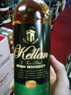
In other news, I've spotted my name in the wild, and it's not that dufus Kellan Lutz's fault.


This seems stupid to you folk with common names, but this really is an event for me. Now if only I was a fan of Irish whiskey...

Apologies for this mostly meaningless post. I suppose it means I'm catching on to this blogging thing. I mean, 3 posts in three days? I'm totally getting better.

Saturday, October 2, 2010

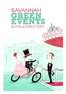
Savannah Green Guide

In yesterday's post I made mention of a final version of the Savannah Green Guide cover. I've finished it, for the most part. I'm submitting it to Cari Clark of Clark Creative, the agency behind the guide. I'm mostly looking for input on the color scheme, and if she likes it or wants some tweaks. Not much else to say. The concept is pretty straight-forward, and hopefully communicates well. I've got to get started on the spot illustrations for the chapters/categories within the guide. Luckily those just have to be linework!


The logo is a placeholder/mockup. I stole it from the website http://www.savannahgreenguide.com and it could very well end up being rather different, or with more text.