Hi folks. Due to a more user-friendly interface and better design options, I've decided to uproot my blog here at blogger and move it over to tumblr. It's not without regret, though. I'm sure I'll lose a few followers in the process and some nice encouraging comments didn't make the journey like all my old salvaged posts did. My new blog can be found here: http://kellanstover.tumblr.com/
I haven't yet changed the blog link on my portfolio site to reflect this change, but it will happen soon. Head over to my tumblr to read a inaugural update!

Monday, January 30, 2012

Wednesday, January 4, 2012
Let's catch up
Hey all you crazy cats. In typical Kellan fashion, I took another leave of absence, but I do come bearing gifts!
Back in November, I was approached by Active Interest Media to illustrate a spread and mini-spots for an article in Amazing Wellness Magazine. The subject matter was pretty quirky and seemed like a pretty good fit for my art style. How else should a piece about health supplements in a beauty pageant be illustrated but in a cartoony, lighthearted style? The folks at AIM were really pleasant to deal with, the negotiation process went swimmingly, and the schedule, while quick, was still comfortable and went off without a hitch. I thought I'd elaborate on my process work, and the stages that happen before my finished product.
First, I was given the article to read, and the layout to compose my image around. Normally the client would be very open to multiple concepts for the piece, but due to the limited time, I instead created comps based on the idea they gave me. Speaking of comps, my policy is to create 3 clean, developed sketches per project. Here they are in the sent document:


The client chose comp #3, and requested a different image for the 'collagen' spot. I then put together some color comp options for their approval.

They chose the first comp, and I set about finishing all the final artwork. This is what I came up with:


Like I said, it was a great experience. My copies should be getting to me soon, so I'll probably take some cheesy photo of me holding the printed version. Getting published will probably be exciting like this for quite a while. I don't plan on becoming jaded anytime soon.
My New Year's resolution this year was to really push myself in my freelance career. It's been a constant struggle to keep myself motivated after coming home from a day's hard work at the animation studio. I did personal work sporadically, and one gig as seen above, but completely dropped the ball on additional promotion and just didn't see myself really GOING for it like I should. So, I'm hoping the good vibrations I'm feeling will carry me forward in both facets of my career. As far as Powerhouse goes, I still can't really talk about it. It's getting really close to becoming public knowledge, when I can actually SAY what I'm working 40hrs a week on. But even then I can't show you! In the meantime I'll show you the beginnings of another pet project I started that may or may not fall by the wayside if my creative ADD has anything to do with it:

I was feeling super inspired by one of the Christmas gifts Caitlin gave me, a 1949 edition of The Fireside Cook Book, illustrated by Martin and Alice Provensen, huge inspirations to 50s animation design, and thus a huge inspiration to me. The illustrations in the book mostly consist of black line drawings accented by solid, single tone shapes that are just dripping with divine design and simplicity.


(credit: Martin and Alice Provensen)
It's an aesthetic I've flirted with but never really jumped into head first. I always find myself starting simple, but adding more and more to a point that's still pleasing and cohesive, but just lacking that spark that the brilliantly simple work of the Provensen's has. But back to Georgie boy up there. I just started drawing him last night. I have no idea why. But I kind of realized that doing a series of all the presidents would provide a consistent exercise in character design, with a touch or caricature, and would even allow me to work on characters from various periods of history. I dunno, it just seems like lots of fun. As I said before, my attention could stray...
Let's hope not.
Happy New Year everyone. I've had a great couple of weeks seeing great friends and loved ones, eating mountains of amazing food, and getting great gifts. I can only hope you've done the same. 2012!
Back in November, I was approached by Active Interest Media to illustrate a spread and mini-spots for an article in Amazing Wellness Magazine. The subject matter was pretty quirky and seemed like a pretty good fit for my art style. How else should a piece about health supplements in a beauty pageant be illustrated but in a cartoony, lighthearted style? The folks at AIM were really pleasant to deal with, the negotiation process went swimmingly, and the schedule, while quick, was still comfortable and went off without a hitch. I thought I'd elaborate on my process work, and the stages that happen before my finished product.
First, I was given the article to read, and the layout to compose my image around. Normally the client would be very open to multiple concepts for the piece, but due to the limited time, I instead created comps based on the idea they gave me. Speaking of comps, my policy is to create 3 clean, developed sketches per project. Here they are in the sent document:


The client chose comp #3, and requested a different image for the 'collagen' spot. I then put together some color comp options for their approval.

They chose the first comp, and I set about finishing all the final artwork. This is what I came up with:


Like I said, it was a great experience. My copies should be getting to me soon, so I'll probably take some cheesy photo of me holding the printed version. Getting published will probably be exciting like this for quite a while. I don't plan on becoming jaded anytime soon.
My New Year's resolution this year was to really push myself in my freelance career. It's been a constant struggle to keep myself motivated after coming home from a day's hard work at the animation studio. I did personal work sporadically, and one gig as seen above, but completely dropped the ball on additional promotion and just didn't see myself really GOING for it like I should. So, I'm hoping the good vibrations I'm feeling will carry me forward in both facets of my career. As far as Powerhouse goes, I still can't really talk about it. It's getting really close to becoming public knowledge, when I can actually SAY what I'm working 40hrs a week on. But even then I can't show you! In the meantime I'll show you the beginnings of another pet project I started that may or may not fall by the wayside if my creative ADD has anything to do with it:

I was feeling super inspired by one of the Christmas gifts Caitlin gave me, a 1949 edition of The Fireside Cook Book, illustrated by Martin and Alice Provensen, huge inspirations to 50s animation design, and thus a huge inspiration to me. The illustrations in the book mostly consist of black line drawings accented by solid, single tone shapes that are just dripping with divine design and simplicity.
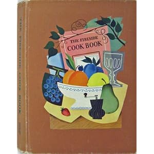

(credit: Martin and Alice Provensen)
It's an aesthetic I've flirted with but never really jumped into head first. I always find myself starting simple, but adding more and more to a point that's still pleasing and cohesive, but just lacking that spark that the brilliantly simple work of the Provensen's has. But back to Georgie boy up there. I just started drawing him last night. I have no idea why. But I kind of realized that doing a series of all the presidents would provide a consistent exercise in character design, with a touch or caricature, and would even allow me to work on characters from various periods of history. I dunno, it just seems like lots of fun. As I said before, my attention could stray...
Let's hope not.
Happy New Year everyone. I've had a great couple of weeks seeing great friends and loved ones, eating mountains of amazing food, and getting great gifts. I can only hope you've done the same. 2012!
Sunday, September 18, 2011
Budding Ideas
I'm not feeling especially chatty tonight. However, I have work to show, so I suppose I gotta throw some words in with them, right? Right.
My boss at Powerhouse Animation Studios recently started an organization called Artists Against Cancer to benefit an employee currently undergoing chemotherapy for breast cancer, as well as anybody unlucky enough to be struck with any form of cancer. On the 27th of October, Artists Against Cancer (AAC) is putting on a benefit concert headlined by some local Austin bands. Our most recent task for "The Luck of the Draw", our biweekly drawing contest, was to create a poster for the event.

This marked my first piece completed with my brand new Wacom Cintiq 21UX. It's incredibly rewarding and relieving to know that I can literally jump in and create whenever I want. That's not to say I couldn't do that before with paints and pencils and the like, but I've settled into a pretty regulated workflow that is digital-centric. That said, I've wanted to get back into painting, as a complete omission of traditional techniques would be counter productive, considering my digital method is intended to evoke the traditional. It would be forgetting one's roots. So maybe look forward to some good ol' gouache stuff in the future. That used to be my bread and butter, but I've been spoiled to the user-friendly and time saving techniques inherent to digital creation.
The next matter of business is this idea I've got kickin' around my head. Caitlin has recently been getting really great feedback on her illustration work, and got some pointers for self promotion as well from book publishers. It was suggested that she create a mock series of consistent characters and story to better allow children's book publishers to see your ability to continue and carry a story through your illustration. It's a pretty self explanatory concept, but it never occurred to me that my menagerie of individual illustrations wouldn't get the whole point across. Needless to say, I'm taking the advice as well.
With that in mind, a little idea started in my head. I've always been a fan of very simple children's books. The kind involving a main character and merely snippets of a loose story. The kind meant for early readers that entertain by color changes, alliteration, and an expressive single character. Perhaps I can't exactly explain what I mean there, but I can at least show you what I intend to do.

This is Daredevil Darryl. He's an adrenaline junky. I intend to flesh out his character more, and put him in other activities, while keeping with the 'D' alliteration. Daredevil Darry dives, dirtbikes, drives, dunks, etc. All while teaching a moral of safety, making sure he is always depicted as fully prepared for each situation. A children's book has to have a moral, after all! I haven't decided on a changing color palette, but I've been thinking a simple swap of the single color (in this case, the red), while retaining the rough paper base, and the blacks and whites.
Sorry to split, but I've run out of words and feel like sketching! Laaaater.
My boss at Powerhouse Animation Studios recently started an organization called Artists Against Cancer to benefit an employee currently undergoing chemotherapy for breast cancer, as well as anybody unlucky enough to be struck with any form of cancer. On the 27th of October, Artists Against Cancer (AAC) is putting on a benefit concert headlined by some local Austin bands. Our most recent task for "The Luck of the Draw", our biweekly drawing contest, was to create a poster for the event.

This marked my first piece completed with my brand new Wacom Cintiq 21UX. It's incredibly rewarding and relieving to know that I can literally jump in and create whenever I want. That's not to say I couldn't do that before with paints and pencils and the like, but I've settled into a pretty regulated workflow that is digital-centric. That said, I've wanted to get back into painting, as a complete omission of traditional techniques would be counter productive, considering my digital method is intended to evoke the traditional. It would be forgetting one's roots. So maybe look forward to some good ol' gouache stuff in the future. That used to be my bread and butter, but I've been spoiled to the user-friendly and time saving techniques inherent to digital creation.
The next matter of business is this idea I've got kickin' around my head. Caitlin has recently been getting really great feedback on her illustration work, and got some pointers for self promotion as well from book publishers. It was suggested that she create a mock series of consistent characters and story to better allow children's book publishers to see your ability to continue and carry a story through your illustration. It's a pretty self explanatory concept, but it never occurred to me that my menagerie of individual illustrations wouldn't get the whole point across. Needless to say, I'm taking the advice as well.
With that in mind, a little idea started in my head. I've always been a fan of very simple children's books. The kind involving a main character and merely snippets of a loose story. The kind meant for early readers that entertain by color changes, alliteration, and an expressive single character. Perhaps I can't exactly explain what I mean there, but I can at least show you what I intend to do.

This is Daredevil Darryl. He's an adrenaline junky. I intend to flesh out his character more, and put him in other activities, while keeping with the 'D' alliteration. Daredevil Darry dives, dirtbikes, drives, dunks, etc. All while teaching a moral of safety, making sure he is always depicted as fully prepared for each situation. A children's book has to have a moral, after all! I haven't decided on a changing color palette, but I've been thinking a simple swap of the single color (in this case, the red), while retaining the rough paper base, and the blacks and whites.
Sorry to split, but I've run out of words and feel like sketching! Laaaater.
Wednesday, September 7, 2011
I BOUGHT A CINTIQ
It's true! I did! Snagged the last one at the online store I stumbled upon. $1,999. More than the market value of my car. AWWEEEEESOME. I should hope this will cause a huge spike in productivity. I mean how can I not draw when I have the sheer awesome power of this product? You can't, that's how! BAM.
I'm excited...but also loopy. I think I will sleep now. G'night!
I'm excited...but also loopy. I think I will sleep now. G'night!
Sunday, September 4, 2011
Minor Site Update
Minor site update today. There's an addition to my resume page and pdf to include Powerhouse Animation Studios as my current employer. Don't let that scare you potential clients. I still have plenty of time for freelance in the evenings and weekends. Seriously! The contact page now has a mailing address (y'know if snail mail is your thing), and I added a new portrait and some new descriptors to the about page. Goody!
Have a great Labor Day weekend, everyone! Err...what's left of it.
Have a great Labor Day weekend, everyone! Err...what's left of it.
Tuesday, August 30, 2011
I am alive. I swear.
Hello everyone! Or just...one.
I've been pretty busy lately. Not too busy to post on my blog. That was just plain neglect. But I have had a lot on my mind and on my plate. I successfully made my move to Austin, and after a month and a half bumming food and shelter from Caitlin's parents, she and I finally moved into our downtown apartment at the beginning of August. It's a one bedroom place, but we ended up making great use of space and Caitlin and I both have our very own studio spaces. Here are some photos of mine:


Now, just picture a nice, new, cintiq monitor right there on that desk. I'll hopefully make that happen very soon. I've got the money ready, just need to find one in stock!
The big news, that isn't really NEW anymore, is that I totally landed the position at Powerhouse Animation Studios. After months of determined pursuit, I was finally hired and started on July 5th. I'm considered a general animator, and I'm usually kept on my toes, hopping from one project to another, ranging from fluid disney-esque animation, to puppeted stuff (similar to my personal work), and with a few character design opportunities in there as well. I show up at 9, grab a cup of coffee, work on a cintiq and computer that's all my own for 8 hours (plus lunch) and come home at 6. Most of the contracts are secret and I have to keep quiet or the clients will murder me or eat my first-born child and whatnot, but so far I have worked on some super-cool stuff. Things I never thought I'd get anywhere near touching this early out of school. The pay is good, the people are awesome, and I'm really enjoying and relishing the security it provides. Benefits kick in soon, too! I should really update my resume, huh?
Here's my company photo from my employee page:

It's no coincidence that I'm holding a copy of Cartoon Modern, my most favorite book ever.
There is a biweekly drawing contest at work between the employees, called the Luck of the Draw. So far the subject matter has been new employees (I was one of a few). Two have been done so far and here are my entries:

Louis

Evgeny
These pieces really are the closest thing to illustration I have done since the end of school, however. I have found there is one detriment to having this animation job. It certainly requires a lot of focus and energy that could be going toward my freelance career. In order to succeed at both, and bolster a client base, I'm going to need to push myself harder, and find a groove so that my illustration aspirations don't fall by the wayside. As of now, it's much too easy to clock out at 6, come home, eat dinner, and lounge around until bed. Wake. Repeat. It's hard to escape this feeling that I've already got a job and I don't need to do more work. And that is true. But only monetarily. I've found that what I crave is the achievement and praise that comes along with illustration projects. The money is an added bonus. So while I certainly enjoy my studio job, it can't fill that void, and I suppose I never expected it to. I just have to try and try, and not forget my aspirations. Wish me luck.
I could continue blathering, but it is getting late and I have work in the morning. Goodnight all!
I've been pretty busy lately. Not too busy to post on my blog. That was just plain neglect. But I have had a lot on my mind and on my plate. I successfully made my move to Austin, and after a month and a half bumming food and shelter from Caitlin's parents, she and I finally moved into our downtown apartment at the beginning of August. It's a one bedroom place, but we ended up making great use of space and Caitlin and I both have our very own studio spaces. Here are some photos of mine:


Now, just picture a nice, new, cintiq monitor right there on that desk. I'll hopefully make that happen very soon. I've got the money ready, just need to find one in stock!
The big news, that isn't really NEW anymore, is that I totally landed the position at Powerhouse Animation Studios. After months of determined pursuit, I was finally hired and started on July 5th. I'm considered a general animator, and I'm usually kept on my toes, hopping from one project to another, ranging from fluid disney-esque animation, to puppeted stuff (similar to my personal work), and with a few character design opportunities in there as well. I show up at 9, grab a cup of coffee, work on a cintiq and computer that's all my own for 8 hours (plus lunch) and come home at 6. Most of the contracts are secret and I have to keep quiet or the clients will murder me or eat my first-born child and whatnot, but so far I have worked on some super-cool stuff. Things I never thought I'd get anywhere near touching this early out of school. The pay is good, the people are awesome, and I'm really enjoying and relishing the security it provides. Benefits kick in soon, too! I should really update my resume, huh?
Here's my company photo from my employee page:

It's no coincidence that I'm holding a copy of Cartoon Modern, my most favorite book ever.
There is a biweekly drawing contest at work between the employees, called the Luck of the Draw. So far the subject matter has been new employees (I was one of a few). Two have been done so far and here are my entries:

Louis

Evgeny
These pieces really are the closest thing to illustration I have done since the end of school, however. I have found there is one detriment to having this animation job. It certainly requires a lot of focus and energy that could be going toward my freelance career. In order to succeed at both, and bolster a client base, I'm going to need to push myself harder, and find a groove so that my illustration aspirations don't fall by the wayside. As of now, it's much too easy to clock out at 6, come home, eat dinner, and lounge around until bed. Wake. Repeat. It's hard to escape this feeling that I've already got a job and I don't need to do more work. And that is true. But only monetarily. I've found that what I crave is the achievement and praise that comes along with illustration projects. The money is an added bonus. So while I certainly enjoy my studio job, it can't fill that void, and I suppose I never expected it to. I just have to try and try, and not forget my aspirations. Wish me luck.
I could continue blathering, but it is getting late and I have work in the morning. Goodnight all!
Monday, June 13, 2011
Post-Graduation Extravaganza
So much to share with you today. As I write this, I'm sitting in a cluttered guest room at my folks' place in Alpharetta, GA. Cluttered because I can't unpack any of the things I brought home, as I'll soon be packing it up again to head to Austin, TX. Y'know, to LIVE. I graduated magna cum laude with a BFA in illustration from The Savannah College of Art and Design last saturday, the 4th of June. It's been a wonderful 4 years, and a wonderful week off from work. Well that's not true. I've still been at work, just a different kind. The preparatory kind. I decided it was time to add a blog post to my list of things to do.
First off, the graduation festivities!

Here I am in front of the piece of mine that made it into SCAD's 2011 Communication Arts show. This piece is getting pretty good exposure and mileage!

The next night was the SCAD Illustration Club senior show. These are the 4 pieces I chose for the show (that will be soon hanging in my future apartment)

I'm a blurry, splotchy, graduate!

Me and my lovely girlfriend, Caitlin after the ceremony. Pardon my sweaty, stupid hair.

Me and my buds

Graduation gifts from my folks! I got a GPS unit and Caitlin got a blender/food processor. Not pictured is the gift I got from the Alexanders...a 2 burner gas grill! Manly!
Needless to say, it was an awesome experience. I feel so old, but with so much more ahead of me.
Now, about all those materials I created in my last illustration class:

My envelope mailers, consisting of cover letters, tearsheets, a postcard, and business card (sorry for the dim, poor quality. These are mac photobooth pictures in dim lighting)

A closeup of the logo sticker on my envelopes. No return address as of yet. Waiting until I have a permanent one.

My handmade physical portfolio binder and box! This thing was a labor of love and I'm so happy with it. Made with bookbinding/davey board, PVA glue, paper-backed book cloth, canson paper interior, 3 ring binding mechanism and page sleeves of course. Visible here is just the outer box/case.

The open side of the box and the binder spine within it.

Dunno if you could tell, but the logo is inlaid. So fancy.

The binder slides out.

The binder.

Cover page.

interior pages.
That's all for the portfolio. I'll be lugging it around to potential interviews with art directors at publishing companies and editorials. It's suggested you have two, though. That'll be another $200+ and 10hr investment right there.
Here be my business card and postcard:

business card front. That's my info, yup.

business card back. Good ole Slick the Cowboy!

postcard front. Like I said, mileage.

postcard back. Decided to spiff it up. If you're an art director at a publication with quirky artwork like mine, expect one in the mail. Now to get stamps...
I'm sure there's something I've omitted. I certainly did more in my class than just this. I created a resume, artist statement, business/marketing plan, contract/document forms, tearsheets, client lists, etc. but none of that is interesting to you, the viewer. So this is all the visual candy (aside from the website, but you saw then on your way here). Up next is the true self-promotion process wherein I will utilize all of the above. Wish me luck!
P.S. Here's a little doodle I did in the last few days of school. Just something goofy. Enjoy?

First off, the graduation festivities!

Here I am in front of the piece of mine that made it into SCAD's 2011 Communication Arts show. This piece is getting pretty good exposure and mileage!

The next night was the SCAD Illustration Club senior show. These are the 4 pieces I chose for the show (that will be soon hanging in my future apartment)

I'm a blurry, splotchy, graduate!

Me and my lovely girlfriend, Caitlin after the ceremony. Pardon my sweaty, stupid hair.

Me and my buds

Graduation gifts from my folks! I got a GPS unit and Caitlin got a blender/food processor. Not pictured is the gift I got from the Alexanders...a 2 burner gas grill! Manly!
Needless to say, it was an awesome experience. I feel so old, but with so much more ahead of me.
Now, about all those materials I created in my last illustration class:

My envelope mailers, consisting of cover letters, tearsheets, a postcard, and business card (sorry for the dim, poor quality. These are mac photobooth pictures in dim lighting)

A closeup of the logo sticker on my envelopes. No return address as of yet. Waiting until I have a permanent one.

My handmade physical portfolio binder and box! This thing was a labor of love and I'm so happy with it. Made with bookbinding/davey board, PVA glue, paper-backed book cloth, canson paper interior, 3 ring binding mechanism and page sleeves of course. Visible here is just the outer box/case.

The open side of the box and the binder spine within it.

Dunno if you could tell, but the logo is inlaid. So fancy.

The binder slides out.

The binder.

Cover page.

interior pages.
That's all for the portfolio. I'll be lugging it around to potential interviews with art directors at publishing companies and editorials. It's suggested you have two, though. That'll be another $200+ and 10hr investment right there.
Here be my business card and postcard:

business card front. That's my info, yup.

business card back. Good ole Slick the Cowboy!

postcard front. Like I said, mileage.

postcard back. Decided to spiff it up. If you're an art director at a publication with quirky artwork like mine, expect one in the mail. Now to get stamps...
I'm sure there's something I've omitted. I certainly did more in my class than just this. I created a resume, artist statement, business/marketing plan, contract/document forms, tearsheets, client lists, etc. but none of that is interesting to you, the viewer. So this is all the visual candy (aside from the website, but you saw then on your way here). Up next is the true self-promotion process wherein I will utilize all of the above. Wish me luck!
P.S. Here's a little doodle I did in the last few days of school. Just something goofy. Enjoy?

Friday, May 13, 2011
2 New pieces. Abruptly.
Hi all. I just wanted to these 2 recent pieces up on here to make myself feel better about neglecting this blog. I've been quite busy lately, and while I have tons to show and lots to talk about, I just can't make the time for it at the moment. I've made business cards, postcards, envelopes, tearsheets, resumes, artist statement, a NEW WEBSITE, and in the process of hand-making a new portfolio book, but just can't plop down here and spread it all out for you. After graduation, I swear (which is still like 3 weeks...).
Anywho, these two pieces were made in the last 3 days, and are intended to fill some gaps in my portfolio.
This one was for a conceptual editorial example:

It's based on the rising popularity of cloud computing, the idea that at any given moment, on any given device, you can access your needed files on a everpresent "cloud" network. You've probably seen the commercials some companies have about it. I really want to get published in Wired magazine. I find its blend of geekery with sophisticated design sense to be just perfect, and I hope this piece tickles their fancy. I chose the subject matter with them specifically in mind.
This next piece was to exemplify design and hand lettering:

I love drawing instruments, and think this really shows other facets of my style (and I used PURPLE. That hardly ever happens!) At first I wanted to do a gig poster for a band, but couldn't settle on anything and didn't want to get so specific. Soooo I just got sophisticated instead. I'm going to give a huge nod to Disney's "Toot, Whistle, Plunk, and Boom" here as it was my major inspiration. You should totally check it out if you've never seen it.
Anyway, g'bye everybody. Enjoy!
Anywho, these two pieces were made in the last 3 days, and are intended to fill some gaps in my portfolio.
This one was for a conceptual editorial example:

It's based on the rising popularity of cloud computing, the idea that at any given moment, on any given device, you can access your needed files on a everpresent "cloud" network. You've probably seen the commercials some companies have about it. I really want to get published in Wired magazine. I find its blend of geekery with sophisticated design sense to be just perfect, and I hope this piece tickles their fancy. I chose the subject matter with them specifically in mind.
This next piece was to exemplify design and hand lettering:

I love drawing instruments, and think this really shows other facets of my style (and I used PURPLE. That hardly ever happens!) At first I wanted to do a gig poster for a band, but couldn't settle on anything and didn't want to get so specific. Soooo I just got sophisticated instead. I'm going to give a huge nod to Disney's "Toot, Whistle, Plunk, and Boom" here as it was my major inspiration. You should totally check it out if you've never seen it.
Anyway, g'bye everybody. Enjoy!
Sunday, March 13, 2011
Winter comes to a close
Another post, and another instance of my blog neglect. Yet again, I have tons of stuff to plop into this post that should have been steadily posted over the past 3 weeks or so. I spoke of upcoming projects in the last entry, and they're all done now! I'll just get down to business, then.
In Digital Cel class, I completed my lip sync animation as well as a 15 second animated spot for the SCAD animation department for my final project. I feel that every assignment is an amazing springboard to more and more understanding of Flash and how applicable this work is to my illustration. I feel so much more well-rounded as a commercial artist. Let's hope that means lots of jobs in the future! Here are the two animations:
Fun Fun.
Illustration Portfolio class just wrapped up as well, and there are 2 more pieces to show. The characters from before have been completed, as well as the background/layout incorporating them. I'm very satisfied with these pieces. I surprised myself with how dense and detailed the saloon piece ended up. I spent much longer on it than the average artwork, and I think it shows. I also feel like I made another landmark in my journey to nail a style that comes second nature. Things seemed to flow from my hand more than ever. Hope that makes sense.


In other news, the Society of Illustrators NY 2011 Student Competition was exciting enough, but things got even better. I was surprised when two of my pieces were selected a few weeks ago, as I didn't see it coming nor would I expect to be recognized by the reputable face for american illustration. That being said, imagine how floored I was to be casually informed by my professor that my piece...

was awarded a $1000 scholarship by SOI NY. I haven't been given official details yet, just an assured 'you got it' from the faculty. As much as I wish I could fork over that money for anything of my choosing (Cintiq monitor....droooool), I must remind myself that that money will be food, gas, and supplies for survival for the next few months. I'm feeling so much encouragement recently, but hoping it's not a fluke! I'm negative like that.
Regardless, it's been a wonderful close to a BUSY quarter. Just one more left before I begin real life. Cross your fingers for me.
In Digital Cel class, I completed my lip sync animation as well as a 15 second animated spot for the SCAD animation department for my final project. I feel that every assignment is an amazing springboard to more and more understanding of Flash and how applicable this work is to my illustration. I feel so much more well-rounded as a commercial artist. Let's hope that means lots of jobs in the future! Here are the two animations:
Fun Fun.
Illustration Portfolio class just wrapped up as well, and there are 2 more pieces to show. The characters from before have been completed, as well as the background/layout incorporating them. I'm very satisfied with these pieces. I surprised myself with how dense and detailed the saloon piece ended up. I spent much longer on it than the average artwork, and I think it shows. I also feel like I made another landmark in my journey to nail a style that comes second nature. Things seemed to flow from my hand more than ever. Hope that makes sense.


In other news, the Society of Illustrators NY 2011 Student Competition was exciting enough, but things got even better. I was surprised when two of my pieces were selected a few weeks ago, as I didn't see it coming nor would I expect to be recognized by the reputable face for american illustration. That being said, imagine how floored I was to be casually informed by my professor that my piece...

was awarded a $1000 scholarship by SOI NY. I haven't been given official details yet, just an assured 'you got it' from the faculty. As much as I wish I could fork over that money for anything of my choosing (Cintiq monitor....droooool), I must remind myself that that money will be food, gas, and supplies for survival for the next few months. I'm feeling so much encouragement recently, but hoping it's not a fluke! I'm negative like that.
Regardless, it's been a wonderful close to a BUSY quarter. Just one more left before I begin real life. Cross your fingers for me.
Wednesday, February 16, 2011
This here be a biggun'
I have so much stuff to slap on this post that I really don't know how to organize it. I suppose I'll try to do them in order, by class, and in an orderly fashion. Since my last post, I've completed 2 pieces for Illustration Portfolio (and a third in progress), and 2 flash animations for digital cel class.
ILLU Portfolio project 1:
I decided that this piece would be exemplary for the advertising/poster design side my work could suit. I took a step back and looked at my portfolio and noticed a distinct lack of animals. My first instinct was for a zoo poster of a whole butt-load of animals, y'know, for practice. As you can see by the final piece, I decided to focus it just a bit. Due to my close proximity to it, I chose Zoo Atlanta. I hear another panda was just born there...but I decided on a lion. Apologies for the lack of progress work. The files seem to have vanished, and the only other copies are on the school network, which is crapped out at the moment. Here is the final piece.

Digitally colored over scanned sketch.
ILLU Portfolio project 2:
Another avenue for illustration I'm highly interested in pursuing is children's books. So, for my second assignment, I decided to create a double page spread for one. Now it's not a fleshed out story, just imagery I found suitable for a Kellan Stover children's book. I was working on this assignment at the same time as the first flash assignment (read below) so they went hand in hand and the inspiration and designs really were compatible. I was in medieval mode.
Here are my thumbs. They're sloppy and mostly for my brain to decipher and not others. Apologies.


Once again, I don't have all the files, or I would show you the comp sketch I settled on, but I took the imagery in the thumb of the rider on the hilly path and ironed it out compositionally and color-wise and came up with this final piece:

It's still simple, but it's the most involved piece I've created in a while.
ILLU Portfolio project 3 (in progress):
I thought I'd quickly throw up these black and white value character designs for my third project. The third and fourth project are intended to go hand in hand. For the third I am making a lineup of character to then occupy a scene, my fourth. I decided, since I want my day job to be animation (while moonlighting as a freelance illustrator), I should play up those strengths with some strong character design and animation layout work. I won't talk about it a lot now, since it's not done. But I will say that it is a western theme, and I'm really excited for it.

Dat's dem. Keep and eye out for when they get to be DOING STUFF in a LOCATION which may or may not be a SALOON!
Digital Cel Animation Project 2:
A flash assignment based on simple object animation set to 30 seconds of music. No frame by frame. Just simple tweens and 'cheat' effects. Our teacher gave us the option of working geometrically/abstract or narratively with characters. We all took the bait and went the narrative route. I did so because as soon as I heard '30 seconds of music' I immediately thought of 'Her Majesty' by The Beatles, and had the perfect idea. I'll just post it without further adieu, since the due date was quick and prelim work was unsubstantial.
(there are framerate issues in the beginning shot that wouldn't get fixed no matter how many times I uploaded it)
Digital Cel Animation Project 3:
A walk cycle. We were given a week for this. It seemed a shorter assignment time than normal, but I thought 'no biggy, I've done plenty walk cycles before'. It ended up kind of being a time suck because of how far I kept wanting to push it and being a perfectionist about it. But gladly it never ever got to be draining or boring. I loved every second of it. There really is something to be said about illustrations of yours really coming to life. It's something magical. You'll recognize the cowboy design from above. I designed him in tandem and he'll show up in both. I named him Slick just for fun. I found it really interesting finding a balance between motion tweens (arm rotation and body undulation, hat, etc.) and frame by frame (legs, hand rotation, pistol grab, etc.). Any obvious valley between them would stick out like a sore thumb, yet both were necessary for aesthetic and time reasons. Working on the background was just the cherry on top. Needless to say, I'm very happy with it. Check it out.
Next I'm working on a 15 second lip sync animation. I recorded my own audio and augmented the voice. It should be a blast. Stay tuned.
IN OTHER NEWS...
Toward the beginning of the quarter Caitlin and I were informed that our work had been selected to be in the Society of Illustrators Los Angeles' Illustration West 49 annual show. Even better, we had multiple pieces selected! We had to hustle to get them printed framed and shipped to LA quickly, but it all worked out and we hung at Gallery Nucleus in Alhambra for a whole week! We'll also be on the SI-LA gallery page for years to come. In the nested image gallery, I'm 17 rows from the bottom. You'll recognize my three pieces! Here's my link on the Gallery Nucleus page. The pieces are no longer for sale (even though it says they still are) since the pieces are sitting at the package center back here in Savannah waiting for me to pick them up.
These are the three accepted pieces


If that wasn't enough, a special event was held to honor all of the students from the department who got work in. Believe it or not there were FOURTY NINE of us! We dominated the competition. The school with the second most entries has 9 times LESS! If there was ever a shining moment for our department since my time here it is now. I'm so happy to be involved in such a successful program. I think our professors realized this, and even the school's president did. I mean, we were served hors d' ouevres by caterers and drank soda from glass bottles with straws and cloth napkins. It was so neat. Here are some shots of Caitlin and I in the festivities that I stole from my professor, Mohamed Danawi's facebook page:


I came home from this event feeling so accomplished. But waiting for me in my inbox back home was another shocker. I had gotten two pieces into the Society of Illustrators NY 2011 Student Scholarship Competition! A jump from west to east coast. I'm still getting details on the competition, but from what I've read so far, SCAD's going to be taking the blow for me and printing, matting, framing, and shipping my work for me this time. Here's to the possibility of a monetary prize! I'm not holding my breath, though. The work I've seen alongside mine, from all across the country, is phenomenal. Just motivation to get even better! Here's the list of accepted SCAD students in the competition. The accepted pieces are the Died Young, Stayed Pretty poster from before as well as this:

I'll let you know how this pans out!
You'll also notice that I have a new portfolio site. I decided to drop the dreamweaver made, illustrative site style I've been using for the past 3 incarnations. It became a little gaudy and proved to be too much of a nuisance to update. I had to go in and replace slice images and a bunch of garbage you don't care about. I decided on a slightly generic template site, and tried to customize it as much as possible. It's certainly lacking the personality I would like, but it's proving functional, and it's not an eyesore. So it's doing its job. Really this is just a sign that I need to learn HTML and Flash webpage development. I'm sure I'll get to it some day.
I'm finally reaching the point where I need to send out applications/feelers to possible employers. Caitlin and I plan on moving to Austin, TX, a creative mecca and all around perfect place to be right now, artistically and economically. As I said before, I really want to work for an animation studio by day. Preferably a flash/web/commercial studio, and one with a lot of the sensibilities my work has. Luckily, literally the best fit for me happens to be in Austin. Powerhouse Animation sits right off the MOPAC highway in Austin. I've watched the demo-reel, scoured the site over dozens of times, and finally sent a little how-do-you-do to the co-founder. While not a full application, just a simple inquiry on open positions, it proved fruitful. Mr. Bruce Tinnin emailed me back saying he liked the work of mine he saw and would like to see more animation (which won't prove to be difficult by the end of school). He said there may be a position open soon, and that I should get back to him in April if I don't hear from him until then. I'm stoked. It's by no means a hire, but it's a huge motivator to bust my ass to make SURE I can plop my butt in front of a cintiq monitor in their studio! MY DARNDEST!
I do believe that is everything I could possibly want to tell you at this moment. My fingers are just about to fall off if I type one mor.....Oh, there they go. I'm now typing this with my palms, as my fingers are gone. Bye bye illustration career. Well g'bye all.
ILLU Portfolio project 1:
I decided that this piece would be exemplary for the advertising/poster design side my work could suit. I took a step back and looked at my portfolio and noticed a distinct lack of animals. My first instinct was for a zoo poster of a whole butt-load of animals, y'know, for practice. As you can see by the final piece, I decided to focus it just a bit. Due to my close proximity to it, I chose Zoo Atlanta. I hear another panda was just born there...but I decided on a lion. Apologies for the lack of progress work. The files seem to have vanished, and the only other copies are on the school network, which is crapped out at the moment. Here is the final piece.

Digitally colored over scanned sketch.
ILLU Portfolio project 2:
Another avenue for illustration I'm highly interested in pursuing is children's books. So, for my second assignment, I decided to create a double page spread for one. Now it's not a fleshed out story, just imagery I found suitable for a Kellan Stover children's book. I was working on this assignment at the same time as the first flash assignment (read below) so they went hand in hand and the inspiration and designs really were compatible. I was in medieval mode.
Here are my thumbs. They're sloppy and mostly for my brain to decipher and not others. Apologies.


Once again, I don't have all the files, or I would show you the comp sketch I settled on, but I took the imagery in the thumb of the rider on the hilly path and ironed it out compositionally and color-wise and came up with this final piece:

It's still simple, but it's the most involved piece I've created in a while.
ILLU Portfolio project 3 (in progress):
I thought I'd quickly throw up these black and white value character designs for my third project. The third and fourth project are intended to go hand in hand. For the third I am making a lineup of character to then occupy a scene, my fourth. I decided, since I want my day job to be animation (while moonlighting as a freelance illustrator), I should play up those strengths with some strong character design and animation layout work. I won't talk about it a lot now, since it's not done. But I will say that it is a western theme, and I'm really excited for it.

Dat's dem. Keep and eye out for when they get to be DOING STUFF in a LOCATION which may or may not be a SALOON!
Digital Cel Animation Project 2:
A flash assignment based on simple object animation set to 30 seconds of music. No frame by frame. Just simple tweens and 'cheat' effects. Our teacher gave us the option of working geometrically/abstract or narratively with characters. We all took the bait and went the narrative route. I did so because as soon as I heard '30 seconds of music' I immediately thought of 'Her Majesty' by The Beatles, and had the perfect idea. I'll just post it without further adieu, since the due date was quick and prelim work was unsubstantial.
(there are framerate issues in the beginning shot that wouldn't get fixed no matter how many times I uploaded it)
Digital Cel Animation Project 3:
A walk cycle. We were given a week for this. It seemed a shorter assignment time than normal, but I thought 'no biggy, I've done plenty walk cycles before'. It ended up kind of being a time suck because of how far I kept wanting to push it and being a perfectionist about it. But gladly it never ever got to be draining or boring. I loved every second of it. There really is something to be said about illustrations of yours really coming to life. It's something magical. You'll recognize the cowboy design from above. I designed him in tandem and he'll show up in both. I named him Slick just for fun. I found it really interesting finding a balance between motion tweens (arm rotation and body undulation, hat, etc.) and frame by frame (legs, hand rotation, pistol grab, etc.). Any obvious valley between them would stick out like a sore thumb, yet both were necessary for aesthetic and time reasons. Working on the background was just the cherry on top. Needless to say, I'm very happy with it. Check it out.
Next I'm working on a 15 second lip sync animation. I recorded my own audio and augmented the voice. It should be a blast. Stay tuned.
IN OTHER NEWS...
Toward the beginning of the quarter Caitlin and I were informed that our work had been selected to be in the Society of Illustrators Los Angeles' Illustration West 49 annual show. Even better, we had multiple pieces selected! We had to hustle to get them printed framed and shipped to LA quickly, but it all worked out and we hung at Gallery Nucleus in Alhambra for a whole week! We'll also be on the SI-LA gallery page for years to come. In the nested image gallery, I'm 17 rows from the bottom. You'll recognize my three pieces! Here's my link on the Gallery Nucleus page. The pieces are no longer for sale (even though it says they still are) since the pieces are sitting at the package center back here in Savannah waiting for me to pick them up.
These are the three accepted pieces


If that wasn't enough, a special event was held to honor all of the students from the department who got work in. Believe it or not there were FOURTY NINE of us! We dominated the competition. The school with the second most entries has 9 times LESS! If there was ever a shining moment for our department since my time here it is now. I'm so happy to be involved in such a successful program. I think our professors realized this, and even the school's president did. I mean, we were served hors d' ouevres by caterers and drank soda from glass bottles with straws and cloth napkins. It was so neat. Here are some shots of Caitlin and I in the festivities that I stole from my professor, Mohamed Danawi's facebook page:


I came home from this event feeling so accomplished. But waiting for me in my inbox back home was another shocker. I had gotten two pieces into the Society of Illustrators NY 2011 Student Scholarship Competition! A jump from west to east coast. I'm still getting details on the competition, but from what I've read so far, SCAD's going to be taking the blow for me and printing, matting, framing, and shipping my work for me this time. Here's to the possibility of a monetary prize! I'm not holding my breath, though. The work I've seen alongside mine, from all across the country, is phenomenal. Just motivation to get even better! Here's the list of accepted SCAD students in the competition. The accepted pieces are the Died Young, Stayed Pretty poster from before as well as this:

I'll let you know how this pans out!
You'll also notice that I have a new portfolio site. I decided to drop the dreamweaver made, illustrative site style I've been using for the past 3 incarnations. It became a little gaudy and proved to be too much of a nuisance to update. I had to go in and replace slice images and a bunch of garbage you don't care about. I decided on a slightly generic template site, and tried to customize it as much as possible. It's certainly lacking the personality I would like, but it's proving functional, and it's not an eyesore. So it's doing its job. Really this is just a sign that I need to learn HTML and Flash webpage development. I'm sure I'll get to it some day.
I'm finally reaching the point where I need to send out applications/feelers to possible employers. Caitlin and I plan on moving to Austin, TX, a creative mecca and all around perfect place to be right now, artistically and economically. As I said before, I really want to work for an animation studio by day. Preferably a flash/web/commercial studio, and one with a lot of the sensibilities my work has. Luckily, literally the best fit for me happens to be in Austin. Powerhouse Animation sits right off the MOPAC highway in Austin. I've watched the demo-reel, scoured the site over dozens of times, and finally sent a little how-do-you-do to the co-founder. While not a full application, just a simple inquiry on open positions, it proved fruitful. Mr. Bruce Tinnin emailed me back saying he liked the work of mine he saw and would like to see more animation (which won't prove to be difficult by the end of school). He said there may be a position open soon, and that I should get back to him in April if I don't hear from him until then. I'm stoked. It's by no means a hire, but it's a huge motivator to bust my ass to make SURE I can plop my butt in front of a cintiq monitor in their studio! MY DARNDEST!
I do believe that is everything I could possibly want to tell you at this moment. My fingers are just about to fall off if I type one mor.....Oh, there they go. I'm now typing this with my palms, as my fingers are gone. Bye bye illustration career. Well g'bye all.
Subscribe to:
Posts (Atom)