Thursday, September 30, 2010

A flurry of activity

So the third week of Fall quarter has come and gone, and I've never had so much on my plate at once. I'm taking a course called 'Getting Published', where every assignment is basically a competition between students to come up with a proposal sketch for an actual art director, either at a magazine, newspaper, etc. Whoever gets chosen brings the work to a finish and is put into print! I've been lucky enough to scrape by 2 for 2, and just submitted my 3rd comp sketch for choosing. Because there is the possibility that your work may not be chosen, more assignments are given, to keep everyone busy. So I'm 3 weeks in, and am already starting on my 4th project. It's making my head spin, but I'm getting a huge morale boost from all the nice things professionals are saying about my work.

Assignment 1 was for 'What's Up Annapolis?' magazine. They were looking for an illustration to go with an article about the importance of researching your medical family tree, to see how it may affect you and your children. I decided that for this class, I would stick strictly to my humorous style, even if the source material doesn't call for it. If you think about it logically, I wouldn't be contacted for serious or somber material in the working world, so there's no point in being what I'm not! Luckily, they loved my solution. Here is the sketch I submitted:


They didn't ask for any tweaks, only suggesting a bright, vivid color palette. I shot this to them soon after:


Assignment 2 called for a cover to a new annual called the 'Savannah Green Events Guide', highlighting ways you can throw a clean, earth-friendly party or get-together. I became fixated on the idea of a couple riding a tandem bike to a valet, handing him a bike lock key as opposed to car keys. So...that's what I did:


It was selected, but with some minor tweaks. They would like updated, modern garb, and preemptively asked for a 'modern palette', which I'm thinking means bright and colorful. No problemo. I've just barely started the final piece, so I have nothing to show at this moment. The art director also asked me for work on spot illustrations and icons within the guide, to solidify a look and style throughout. I'm stoked!

Assignment 3 is a cover for and Augusta, GA magazine called Metro Spirit, and is a special issue for their 'Best of 2010' awards. The awards go out to local establishments (best haircut, slab of meat?, etc). Oddly enough, the theme is Las Vegas, the awards themselves being fuzzy dice. And the guidelines for what they wanted were really that simple: Vegas. We've yet to hear their decision, but this is what I came up with:


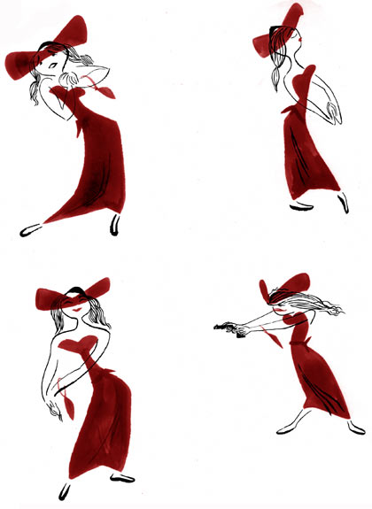
So that's 'Getting Published' in a nutshell, so far. In other news, I've been working really hard on character design development. I'm moving closer and closer to that 50s animation design look I adore so much. I've found an inspiring tool to help me get there. I've found that the best character design is full of continuous lines, and tangents. That's shocking because tangents are often problematic in image composition, and are treated like a plague. I'll let this most recent self-portrait-y thing speak for itself:


I don't know if you can tell what I mean by looking at it, but it makes sense to me, so I suppose that's all that matters. I titled this "If Only I Was A Cowboy". After making this piece, I decided it would be a great exercise in character design to ask my friends what they would like to be, and I intend on creating a series. More on that later.

For now, I gotta get outta here and get to work. Later!

-Kellan

Monday, September 6, 2010

A Quiet Summer

Apologies for being so quiet this summer. I don't really have enough viewers to really feel all that neglectful, though. I'll make up for it anyway by attempting to pack an entire summer's worth of news and information into one post.

I predicted a terrible summer job market here in the metro-Atlanta area, so the thought of actually landing a local job for a few months was not in the forefront of my mind. Instead, I turned my efforts to finding my first freelance illustration job. I scoured and scoured, stumbling upon way too many examples of artist abuse a la elance.com and ifreelance.com. Much of my job search was an education in how little respect commercial art garners amongst the laymen. Everybody needs or wants it, but nobody wants to pay the proper amount, let alone understand it from the artist's point of view. Luckily, these instances are only prevalent in individuals looking for art. Professional institutions are obviously knowledgeable, but at this point, sort of unattainable. In the meantime, I decided to get some postcard mailers created and sent out. This required new artwork specifically crafted for this purpose. I tried to hit as many children's book publishers and editorials as I could. We'll see if there are any fruits of my labor. This is what became the current face for my artwork:


In the confusion and struggle to gain as much knowledge as I could on my own (my only complaint about my SCAD education is that, so far, little has been taught in the vein of self-promotion, contract writing, and dealings with clients), I realized it was the best time to get my mitts on the Graphic Artists Guild's Pricing & Ethical Guidelines Handbook. I'm very glad I did. I feel light years beyond my junior-year self in terms of professionalism and understanding of contracts and the in's and out's of freelance in general. I read and read, practiced rough contracts and my timing couldn't have been better, as I was just about to nail my first professional gig.


David Jafari, creative mind behind SPARKMUSE, an upstart web community for technologists, programmers, and super-nerds (and I mean that in the nicest of ways) contacted me, wanting an illustrative front page for this venture. A landscape, logo, and mascot were needed, and I had ideas in abundance. I tackled the logo first, as its color scheme and style would dictate and influence the rest of the work.

I struggled at first to find a direction. My girlfriend, Caitlin Alexander, a lovely and talented illustrator herself, had recently gifted me a book written by the author of one of my favorite blogs/resources, Cartoon Modern (now long defunct). Within the last year, due to my exposure to animation mentality since declaring it as my minor, I have become completely obsessed and inspirationally in love with 50s animation design. For someone like me who stumbled onto gouache and found his niche seemingly overnight, the work done by these artists more than 50 years ago feels entirely fresh and peculiarly MODERN. I must have watched UPA's Rooty Toot Toot nearly 20 times now.


With the imagery from all these wonderful artists swimming in my head, I decided, with David's input, on a limited, but vibrant color palette, and a simple, almost literal logo concept. The three steps in the SPARKMUSE method are discussion, refinement, and acting upon developed ideas. This led to the three bars, and the prevailing bouncing spark obviously symbolizing the sharing or 'bouncing' of ideas within the community. I was thrilled with the outcome, due to its aesthetic and for what ideas it spawned for the remaining imagery.


The mascot and environment were brainstormed and designed in tandem. The winning idea amongst the numerous sketches was a jetsons-like, futuristic setting, full of whimsy: an embodiment of the forward-thinking ideas of the community. A jetpack-weilding rocketeer became a helicopter contraption pilot, and a floating city in the sky became a bustling, condensed metropolis on a hill. Some parts were painted traditionally, with gouache, while others were purely digital. I find great satisfaction in the seemlesness. I won't bother posting initial sketches. They are truly dreadful and not worth looking at. I'ven ever been the best sketcher. Their worth is in my ability to see a final image through them. It's a wonder Mr. Jafari didn't get scared off. Luckily he had seen my work in completed form before and knew what to expect.


the mascot in his jetpack sketchy days


a quick digital comp for the selected idea


the finished mascot design


A mockup of the final assets.

The early build of the site can be found at SPARKMUSE.com. It moves!

That's all there is as far as career news. In the midst of this work I had time to visit Vermont for my cousin's wedding, Bar Harbor, ME for some relaxation at our family cabin, and a week long trip to see Caitlin in her Austin, TX home. The beginning of a new (and LAST) school year is drawing close. One week, actually. I leave thursday and I couldn't be happier. Summer has been a much appreciated break. But you CAN get too much of a good thing, especially when that good thing comes at the price of being far, far away from the girl you love and the friends you love as well.

Take care!
-Kellan

P.S. Thursday also marks the last day of my late summer experiment. I've never been much for facial hair. I just can't grow it effectively. In order to avoid embarrassment, I keep clean shaven at all times, lest I put a patchy abomination on display. But in these quiet summer days, with little to no interaction with the outside world, I've just let it be. It's been enlightening...in that I now know I can never grow a full beard, just a weak moustache and chin scruff, and some crummy sideburns. Curse my genes.


It has to go or I get the cold shoulder from my girl.

(this post script comes your way after suggestion that I make my blog a bit more personal to put a, well, personality and face to my artwork. You all now know how weird I am. Hope it helps. <3)

Tuesday, May 25, 2010

Bummer

The last assignment for Poster illustration was supposed to be a self promotion piece. A 20x30 'all-about-me' personal piece. I was so excited. Sigh...Then we were told there was a change of plan. Instead we were to illustrate a poster for a 2 year old documentary film about rock posters. Eh, I wasn't feeling it, and I'm still not. Luckily, I churned out something that looks ok. I'm not thrilled, but I'm satisfied. There was little to no guidance on what imagery was appropriate and we weren't even screened the film. Color me confused. I just did whatever goofy idea I could come up with. It's not really up my alley imagery-wise, but I tried to cram my style in there to make up for it.

Monday, May 10, 2010

Another new poster!

This poster assignment was for a music gig. I recently picked up The Tallest Man On Earth's new LP 'The Wild Hunt' and am loving it oh so much. So i picked the performer, and picked the venue on his tour (A folk concert at a BBQ in Austin? C'mon, doesn't get any better than that). The imagery is sort of a play on the lyrics of the song "The Gardener". The narrator talks about killing any naysayers that may come between him and his love interest by telling her the bad things he has done. He buries them to fertilize flowers for her. 'So now he's buried by the daisies, So I could stay the tallest man in your eyes, babe.' It sounds super moody, but really with the melody and guitar, it sounds nothing but sweet.


(Flannel patterning or not?)

So, dead guy produces a big, happy daisy for oddly patterned bees to fly around. I utilized a similar technique to the last poster, creating each element separately and arranging them digitally, for fine-tuning/tweaking purposes. I really like this method. It gives me a lot of wiggle room for composition and color. As far as the aesthetic goes, I pulled a lot of influence from the UPA style seen gallivanting in so much of today's illustration. Specifically, I studied John Hubley's Rooty Toot Toot short animation. Interestingly, my final piece doesn't really resemble it too much but it certainly played a huge role in the process. I was especially fascinated by the character design in the film. Characters are mostly gestural outlines, but one part of the character remains un--outlined and is instead suggested by a flat, hurried brushed color. Here is an example:


Imagine creating the character this way for every frame! Observe the corpse in my poster. I carried over the idea loosely in the creation of the legs and head. I really enjoy this look, and I'm definitely going to explore it farther.

Wednesday, April 21, 2010

Tigers


Poster designing just isn't my thing. My desire to illustrate narratively, with a fully realized character, setting, and situation keeps me from being all that graphic, simple, and striking. So I suppose it's saying a lot that I'm actually rather pleased with the turnout of my newest piece. I illustrated each piece separately so I could compose them exactly how i want, and any colors imaginable. See that was the catch 22. Too many options. It took me a lot of scrambling and color swapping, but I settled on this final look while still adhering to my concept. Tigers are very close to extinction in the wild. The idea is that they are fading away, and only their stripes are left, allowing the background to show through. The placement of the writing on the face, while graphically looks nice, is also meant to emphasize their disappearance. For working outside my comfort zone, I'm rather pleased.

*update* I put a little more work into and think I got something better out of it.

Wednesday, April 7, 2010

New business card and therefore, new art

The SCAD Con is quickly approaching (this friday, actually), and my girlfriend and I have signed up for spots. The Con is an event where artists can display artwork, sell prints, and hand out business cards to professionals in the industry, all in the name of self-promotion. It's in conjunction with the SCAD Career Fair, which those same professionals have displays of their own. Kinda wacky, but whatever.

So the point of the story is that I decided I needed a new business card. A larger, postcard sized one to display some art. So I painted a picture. Enjoy.

Monday, April 5, 2010

So much for being consistent

I kind of knew I'd have a hard time keeping this blog current. Who knew I'd take months to make a second entry? I'll start things off with my work from my last quarter at SCAD, and top it off with something hot off the press for the current quarter.

A label for a paint can of goodies from hotels.com for repeat customers. The lid (which isn't shown) shows a man sticking his head in the 'o' of hotels.com and this label depicts him popping up in locations across the globe.


A poster for the American Museum of Natural History's relocated dinosaur fossil exhibit. Hopefully the concept is self-explanatory.


A simple illustration for the Oatland Island Wildlife Center. The Great Horned Owl is a popular specimen, and is even their mascot.


Another new quarter brings more illustration classes. This time it's Poster Design. It requires a different mode of thinking, that's for sure. I'm so used to narrative, children's book, and editorial flare. It's much harder to think more iconographically, and conceptually. I spared myself a headache by sticking to what I know: Back To The Future.


Fans will argue that Marty never had his sneakers in 1885 Hill Valley, but the poster is a reimagining, and it's much easier and more effective to the concept of time travel to show a visual anachronism like this. I settled on this subject after much debate and stubbornness on my part. I was convinced that a simplistic image of Marty's feet on the hoverboard from Part II would make the PERFECT poster. The only problem was, nobody agreed. And while I could argue that artistic integrity and confidence should lead me to do what I believe in, that doesn't get me a good grade. Doing what the professor says will.


I could ramble on about the politics of producing an image from start to finish right now, and I sort of want to, but it is late, and I would run out of steam without ever really making a lick of sense. I'll spare you the trouble. Buenas noches.