

Tuesday, May 25, 2010
Bummer
The last assignment for Poster illustration was supposed to be a self promotion piece. A 20x30 'all-about-me' personal piece. I was so excited. Sigh...Then we were told there was a change of plan. Instead we were to illustrate a poster for a 2 year old documentary film about rock posters. Eh, I wasn't feeling it, and I'm still not. Luckily, I churned out something that looks ok. I'm not thrilled, but I'm satisfied. There was little to no guidance on what imagery was appropriate and we weren't even screened the film. Color me confused. I just did whatever goofy idea I could come up with. It's not really up my alley imagery-wise, but I tried to cram my style in there to make up for it.

Monday, May 10, 2010
Another new poster!
This poster assignment was for a music gig. I recently picked up The Tallest Man On Earth's new LP 'The Wild Hunt' and am loving it oh so much. So i picked the performer, and picked the venue on his tour (A folk concert at a BBQ in Austin? C'mon, doesn't get any better than that). The imagery is sort of a play on the lyrics of the song "The Gardener". The narrator talks about killing any naysayers that may come between him and his love interest by telling her the bad things he has done. He buries them to fertilize flowers for her. 'So now he's buried by the daisies, So I could stay the tallest man in your eyes, babe.' It sounds super moody, but really with the melody and guitar, it sounds nothing but sweet.


(Flannel patterning or not?)
So, dead guy produces a big, happy daisy for oddly patterned bees to fly around. I utilized a similar technique to the last poster, creating each element separately and arranging them digitally, for fine-tuning/tweaking purposes. I really like this method. It gives me a lot of wiggle room for composition and color. As far as the aesthetic goes, I pulled a lot of influence from the UPA style seen gallivanting in so much of today's illustration. Specifically, I studied John Hubley's Rooty Toot Toot short animation. Interestingly, my final piece doesn't really resemble it too much but it certainly played a huge role in the process. I was especially fascinated by the character design in the film. Characters are mostly gestural outlines, but one part of the character remains un--outlined and is instead suggested by a flat, hurried brushed color. Here is an example:
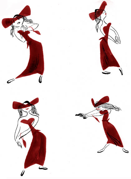
Imagine creating the character this way for every frame! Observe the corpse in my poster. I carried over the idea loosely in the creation of the legs and head. I really enjoy this look, and I'm definitely going to explore it farther.


(Flannel patterning or not?)
So, dead guy produces a big, happy daisy for oddly patterned bees to fly around. I utilized a similar technique to the last poster, creating each element separately and arranging them digitally, for fine-tuning/tweaking purposes. I really like this method. It gives me a lot of wiggle room for composition and color. As far as the aesthetic goes, I pulled a lot of influence from the UPA style seen gallivanting in so much of today's illustration. Specifically, I studied John Hubley's Rooty Toot Toot short animation. Interestingly, my final piece doesn't really resemble it too much but it certainly played a huge role in the process. I was especially fascinated by the character design in the film. Characters are mostly gestural outlines, but one part of the character remains un--outlined and is instead suggested by a flat, hurried brushed color. Here is an example:
Imagine creating the character this way for every frame! Observe the corpse in my poster. I carried over the idea loosely in the creation of the legs and head. I really enjoy this look, and I'm definitely going to explore it farther.
Subscribe to:
Posts (Atom)